Mobile development with Flash and Flex is a new frontier, full of new adventures and discoveries. Recently I discovered something that might be useful to you. By default the mobile web browser on my Android 2.2 device scales a web page to make more room to display pages typically built for a desktop profile. Here is what a little [test mobile Flex app][1] I built looks like:
 Strange! The width and height are larger than the screen resolution. You can fix this by adding the following to the HTML page:
```xml
```
And now it will look like:
Strange! The width and height are larger than the screen resolution. You can fix this by adding the following to the HTML page:
```xml
```
And now it will look like:
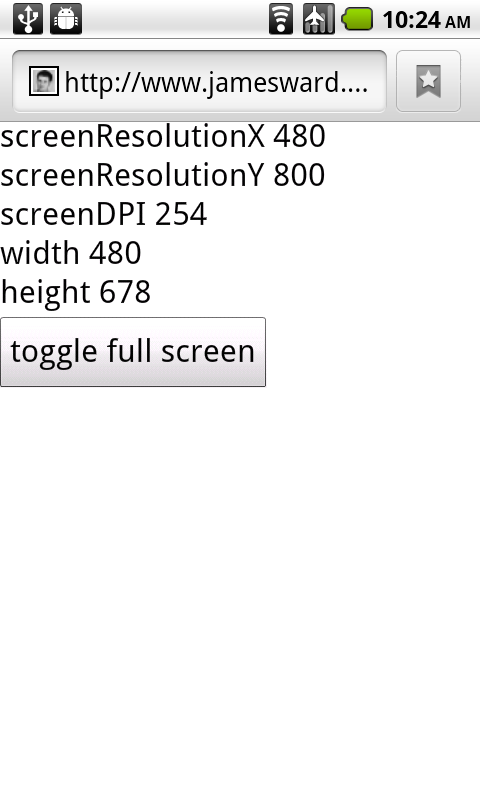 Now that looks right! This also turns off the two-finger / pinch zooming feature for the page (which is more important for content that hasn't been optimized for a mobile profile).
I hope this is useful for those of you embarking on new adventures with Flash / Flex on mobile devices!
[1]: http://www.jamesward.com/demos/MobileSizeTest/MobileSizeTest.html
Now that looks right! This also turns off the two-finger / pinch zooming feature for the page (which is more important for content that hasn't been optimized for a mobile profile).
I hope this is useful for those of you embarking on new adventures with Flash / Flex on mobile devices!
[1]: http://www.jamesward.com/demos/MobileSizeTest/MobileSizeTest.html